Leading the EV charging revolution
Connected Kerb, one of the UK's leading providers of electric vehicle charging infrastructure, was transitioning for high-growth. Having secured investment of £110 million, it was poised to deliver 'game-changing' on-street charging to all corners of the UK and beyond. It needed a website that would reflect its ambition - and - crucially - the seamless customer experiences users expect from leading players in this space. The fly in the ointment: it needed to be done fast.


Build and grow
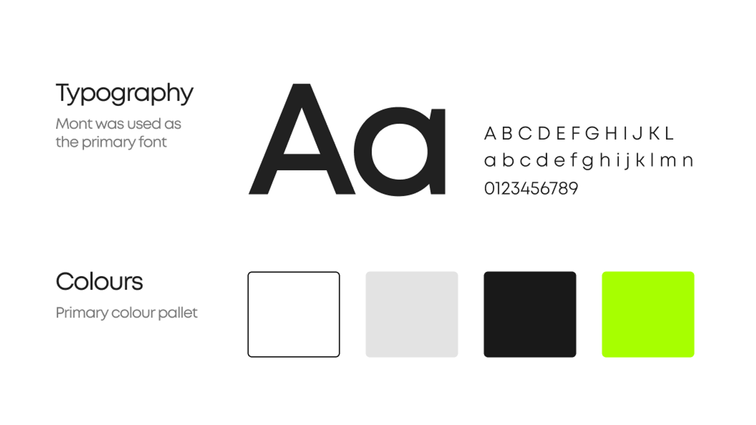
We worked at speed to deliver an MVP in little more than three months that would meet the brand’s ambitions while building a solid platform for future iterations. Agile methodologies helped us adapt to a new visual identity as it emerged, and a rapid but robust ‘discovery’ informed a cutting-edge site architecture. Once we’d validated this architecture through tree-testing with multiple audience groups, we were primed to explore a visual approach and prioritise MVP components.
A dynamic and assured market leader
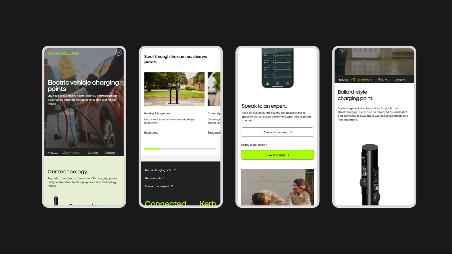
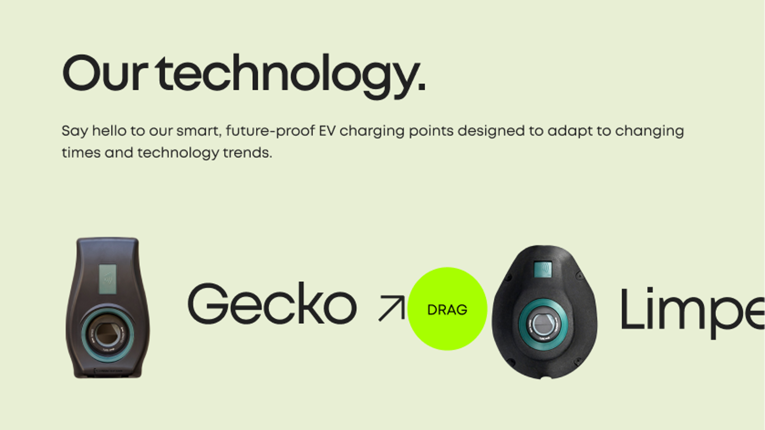
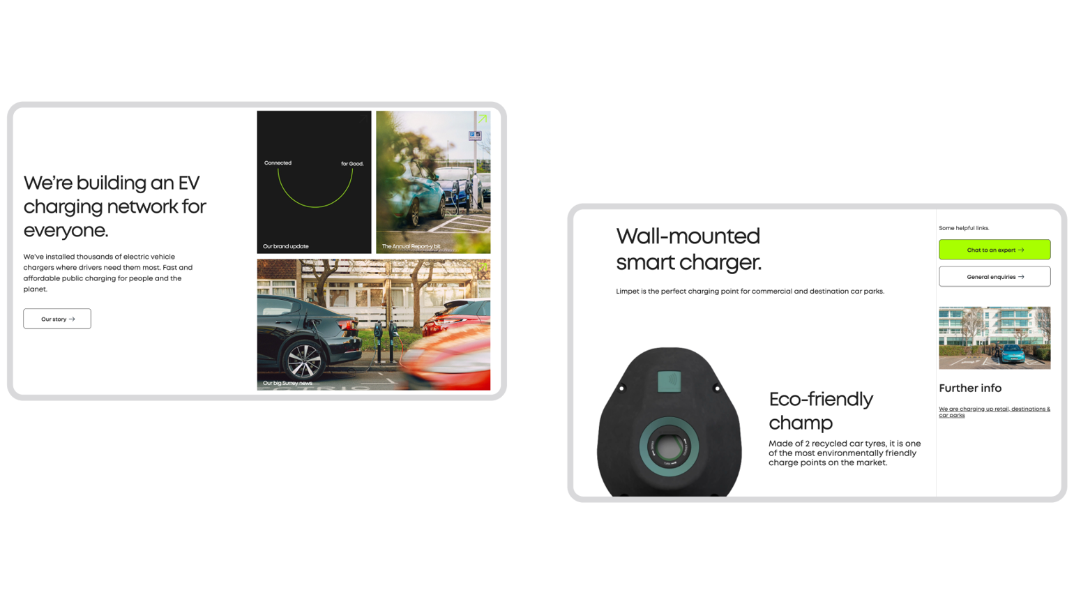
We built the site on the latest Umbraco 11 CMS to provide a light, fast platform with huge scope for development and align with Connected Kerb’s growth plans. As well as bringing seamless experiences to all users, a flexible design system caters for reusability throughout the site and brings consistency with the mobile app. From products to charging-point locations, playful micro interactions position Connected Kerb as a dynamic, assured market-leader. The site will continue to evolve but is already drawing-in EV users as well as current and future partners.
