
At RY, we’ve been talking about inclusive design since 2018 – we even wrote ten principles for communicating Demystifying D&I in early 2020. We work with clients across multiple industries to strike a balance between staying on-brand, communicating with a unique look and feel to cut through, all the while avoiding the dreaded D&I cliches we see all too often by companies of all sizes.
Behind this balance is a talented team of designers, who don’t often get the credit they deserve. I talked to my colleague Harry Fowler, one of RY’s designers, to find out a bit more about what his job entails, how he designs D&I communications without cliches, and what inspires him.
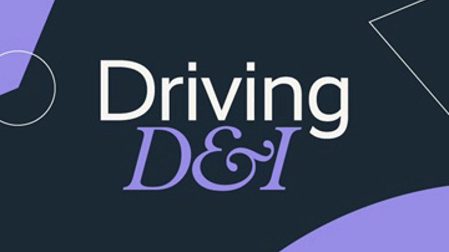
Harry, you’ve been working a lot in the D&I communications space lately, but most recently you were responsible for the design of our ‘Driving D&I’ report. What was the brief?
The brief for this was to take a text-heavy D&I white paper and transform it into something distinctive, engaging, and accessible – without the use of supporting images, and without dipping into the clichés we previously highlighted in Demystifying D&I.
When you’re handed a text-dense document like Driving D&I with no accompanying visuals – where do you find the inspiration to bring it to life in a visual way?
Well, to start with imagery, one of our key ‘Demystifying D&I’ principles is, ‘if you don’t have suitable images, then don’t use imagery’. So, as was the case here, I didn’t. Instead of scrambling to find ‘appropriate’ imagery – which, when you’re scrambling to find inclusive stock imagery almost always comes across as inauthentic – I’ll look to other graphic considerations, from clever typography and treatments to layout and colour.
In terms of a starting point for my inspiration on this, it stemmed from the content of the report itself. What stood out for me was the language within the six key principles: the references to there being no best route, determining your destination, data driving action, and reading from the same roadmap. There was a clear theme emerging about being on a journey - which I felt was a strong metaphor for the D&I journey many organisations are currently on, which is what this report is about.
Ok, so you’ve got your nugget of inspiration: a journey. Where did you go from there?
I took the theme of a journey, and I played with some of its synonymous elements – roads, routes, travel, crossings – and scoured the internet for inspiration, which I arranged into a mood board to help inspire the visual direction of the project.
This initial visual exploration helped conjure up the distinctive shapes of the most ubiquitous road signs which I could see working nicely both graphically and metaphorically for the journey.
I then took the basic road signs, abstracted them into their base shapes and used them in different situations: as a holding shape for text, for background flare and for other subtle elements throughout.
On top of this, I had RY’s brand guidelines to adhere to – much like I would do for any client work. To ensure it looked and felt like other RY reports, I had to utilise brand fonts and colours. I picked purple from our brand colour palette – I find that the RY red can be overwhelming in large quantities and not the most accessible colour on a screen, and the RY green has subtle connotations towards our work in sustainability, so I chose our base navy blue and added our purple colour.
So, it looks great – but we also know from our Demystifying D&I principles that we have to make sure our work is accessible – for instance, if we’re working in a digital space, it might mean giving images ‘alt’ tags to ensure they can be read by screen readers; or if we’re working in film, to add subtitles. What were the accessibility considerations for this piece of work?
We always consider the audience that will be targeted by our work and how they will be engaging with it. It’s important to be mindful that information will be interpreted and digested differently.
This means considering accessible design both on and offline and making sure that there’s a clear hierarchy of information (working with the copywriters and consultants to make sure we’re aligned). As well as ensuring that fonts are legible, and colours and contrasts are accessible.
For this particular report, I ran the colour combination through a contrast checker. This helps to ensure that anyone with colour vision deficiencies will be able to read coloured text on a coloured background and that the design would be clearly legible across different screen types. I actually had to adjust the shade of purple slightly - it didn’t affect the overall design dramatically, but just a small change ensured a wider audience would be able to read the report.
Additionally, I made sure that the text flowed into the design in a way that the PDF can be read by screen-reader software for anyone who may have a visual impairment (or just prefers to listen rather than read!).
With the conversation around D&I moving so quickly, how do you keep up to date with what’s appropriate in terms of imagery, references and accessibility for design?
The Demystifying D&I report, on which this report builds, outlines some of the most prevalent visual clichés in the D&I space – think ‘diversitrees’, rainbow colours and forced stock photography – as well as key principles to apply to any design project; so, I’m continually reaching for that as a trusty reference point.
Having a finger on the pulse of what’s happening in the wider D&I space is essential, too. As designers, I think the more we expand our knowledge and understanding, the more inclusive our thinking – serving to not only enhance our creativity but to continually challenge us to come up with better ideas and better solutions.
Thanks Harry! Finally, can you share any further work design work you’ve been doing in the D&I space?
Definitely! I’m really proud to have helped Wates design its first-ever D&I report, as well as working on some of its recent campaigns against microaggressions; which have received really great feedback from employees, and senior leaders.
Check out Harry’s work in our latest report Driving D&I: diversity reporting with impact, and if you want to chat about how to tackle D&I design – feel free to drop us a line.