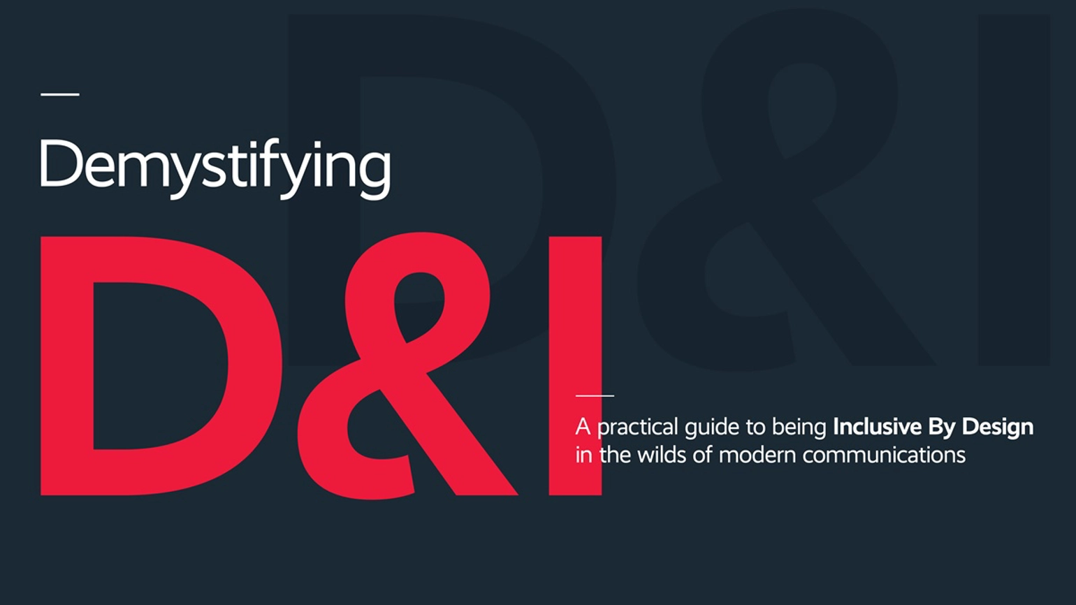
Goodbye clichés, hello inclusive design: how to better visualise D&I
Diversity and inclusion (D&I) is about far more than just good intentions. Done well, it can boost loyalty and drive reputation. Attract talent. Foster innovation. Inspire. Persuade. Increase the bottom line.
But there’s a problem: rapidly increasing complexity.
Communicators, employee engagement leaders, designers and reporters have to navigate a web of issues, nuances and causes. At a time when a simple misstep can crush a reputation or crash a share price, the pressure is on to keep up with an ever-shifting landscape.
Our research has revealed a big side-effect of all this complexity. While 85 per cent of the Forbes 100 Most Valuable Brands are actively communicating their D&I efforts, 45 per cent of them are falling back on D&I clichés along the way.
These clichés – think taglines, ‘diversitrees’, rainbow colours and forced stock photography – risk alienating the audiences that matter most and passing up a valuable opportunity. But it doesn’t have to be this way. With the help of D&I experts and raft of academic studies, we’ve drawn together the latest thinking and exclusive new guidance on better D&I design and communications.
Download it to:
- Read up on winning D&I campaigns
- Get clued up on the clichés to avoid
- Find out what a ‘self-fulfilling faux pas’ is
- Benefit from ten clear D&I design principles
- Explore concepts for your next D&I campaign
Download your copy
We promise not to send you any rubbish when you give us your details, we just want to make sure you get what you need and see how else we can help you.
To download the report, please fill in each field in the form opposite. We do not sell or give your details to third parties.
Demystifying D&I
Loading form
