
Return to journal
What Apple’s liquid glass effect teaches us about breaking (some) UX rules
UX/UI designer, Filipa Rolo, explores how Apple’s bold new aesthetic is changing the way we think about risk, beauty, and what “good design” really means
Every so often, a big player in tech makes a design decision that ripples through the industry, not just because of what it looks like, but because of what it represents.
Apple’s recent liquid glass aesthetic is one of those decisions. It’s glossy. It’s fluid. It’s undeniably beautiful. And it breaks some of the core UX principles many of us have spent years championing such as accessibility, contrast, legibility, and user clarity.
And yet, it’s Apple. So it’s seen. It’s discussed. And, perhaps most interestingly, it’s being emulated.
Agencies, brands, and startups are starting to get braver with their visual decisions. They’re playing more. Taking more risks. And pushing boundaries we used to think were untouchable.
So what does this mean for the future of digital UX and UI? Are we entering an era of more creative freedom, even if it comes at the cost of usability?
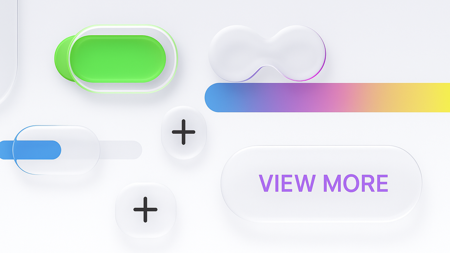
The liquid glass effect: visually striking, functionally flawed
Let’s start with the obvious: Apple’s new aesthetic is captivating. The shimmering overlays, depth effects, and animated translucency evoke something tactile, sensual, and futuristic. It’s a masterclass in visual storytelling.
But from a usability standpoint? It’s problematic.
The excessive transparency and motion can disorient users with vestibular disorders. The contrast in some areas is so low it challenges basic legibility standards. It can be hard to tell where things begin and end, what’s interactive and what’s decorative.
These are not minor concerns. They’re real barriers. And they go against the accessibility guidelines that exist to make the web usable for everyone.
A shift in the air: bravery in the design world
Despite the critiques, something fascinating is happening: designers are feeling emboldened.
We’re seeing brands experiment with unexpected visual treatments, fluid transitions, unconventional layouts, abstract layering. In pitch decks and project kickoffs, references to Apple’s aesthetic are creeping in. “Can we try something like this?” has become a familiar question.
And we get it. Creativity craves moments like these. They remind us that digital design isn’t just about systems, it’s also about excitement and interactivity.
But with that excitement comes responsibility.
Bravery ≠ Carelessness
We believe in bravery, but not at the cost of the user.
Being brave doesn’t mean abandoning best practices. It means knowing them deeply enough to know when and how to break them with intention.
We ask ourselves:
- Does this visual risk serve the brand’s identity or message?
- Can we innovate without excluding users?
- How can we balance delight with clarity?
There’s a big difference between breaking a rule to make something better and breaking a rule because it looks cool. We aim for the former, every time.
What this means for UX and UI going forward
Apple’s liquid glass isn’t just a trend, it’s a signal. A permission slip, of sorts, for the industry to be less rigid. To explore. To lead with emotion first, and support with logic.
The future of digital experience design won’t be about choosing between creative freedom and user experience. It will be about finding new ways to combine them, where beauty and function, accessibility and innovation, can coexist and can be taken further. And we’re here for it.
And while we love pushing boundaries, we always keep accessibility in view. Here are a few reminders when being brave with design:
- Maintain strong colour contrast to ensure readability across all devices and lighting conditions.
- Use motion sparingly and always honour user preferences like 'reduce motion'.
- Avoid excessive transparency that can interfere with text clarity and content hierarchy.
- Test with assistive technologies to make sure visual innovation doesn’t compromise usability.